You know, sometimes, try as we might, we just can’t have it all. And sometimes that means accepting that you’ve got a smaller bathroom than you’d like.
I remember that my first home had a massively cramped box bathroom that could almost make you feel a little claustrophobic while showering.
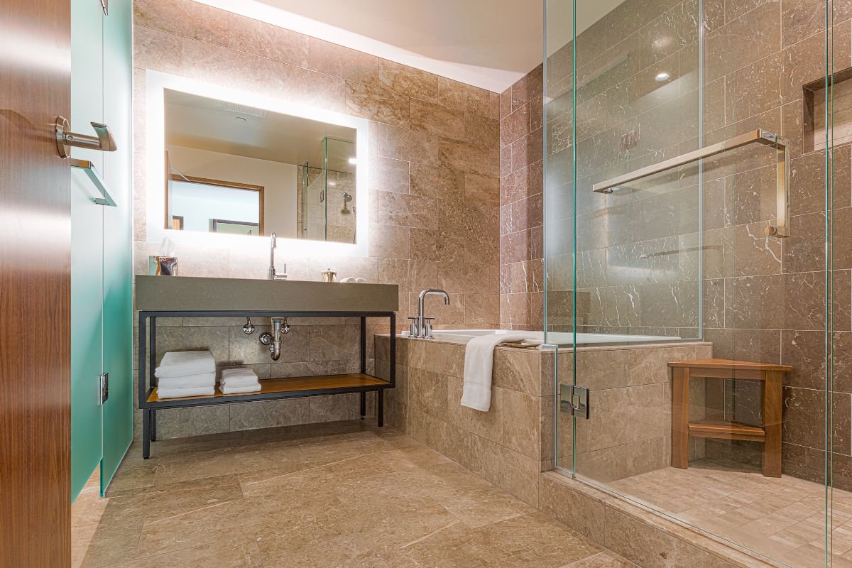
So what do you do? It’s not like you can really just add an extension to the room or move into a new home with a bigger bathroom. At least not on the money I was making. But I had to come up with some type of solution to make it feel a little bigger.
And to be honest, it was more out of luck than intention, that I created a much larger space. I decided to at least try and give a lease of life to the room by adding new tiles to the shower. And the difference it made to the space was unreal.
So in this article, we’ll go over a few different tile options you can choose that will make your room seem much more spacious.
15 Small Bathroom Shower Tile Ideas
1. Small Square Tiles In Blush Pink
I tend to find that particularly small bathrooms can lack natural light which can make them dark and dingy, and this only makes them seem smaller. A color such as blush pink will add some warmth to the room.
Then the much smaller squares of the design draw in your gaze which distracts you from the size of the room. I’d opt for a white grout to keep it light but if you don’t want the upkeep of keeping the grout white then a gold color would work fabulously.
2. Play Around With Tile Shapes
While square and rectangular tiles are your most common options, remember they are not your only options. There are plenty of fun and quirky options to play around with just like the scalloped tiles in this bathroom.
Not only is it unique and playful, but it also averts the eyes and makes the wall seem much bigger which gives the overall room a larger look.
I think white grout is the most obvious choice for this tile. And then don’t forget to pair it with a shower curtain that ties in well with the pattern and color of your tiles.
3. Feel Fresh With Subway Tiles
You can never really go wrong with subway tiles, it’s a timeless look. It adds some brightness to your bathroom and when paired with some black furnishings can also make your bathroom look so sleek and stylish.
4. Mini Hexagon Tiles
Remember earlier when I said there are plenty of ways to play with tile shapes? Well, here’s another great option. These little hexagons are so small that they almost make the wall look bigger and more spacious.
It’s also a great way to add some pattern and color to your bathroom without it being too overwhelming. I love this gray gradient in these tiles, though I’m sure it would look great in many other colors too.
5. Lay Your Tiles Vertically With A Low Ceiling
If your bathroom has a fairly low ceiling, then you’re going to love this trick. Using pale tiles and placing them vertically has this almost stretching effect on your wall. It really elongates it and makes it feel much taller than it actually is.
I really like this creamish beige color paired with the wooden accents, but any pale color will do fine. I imagine pastel shades stacked in this way would look absolutely stunning and would add a little more color if thats your desired look.
6. Blue Ink Tiles
You can make a real feature in your bathroom by using gorgeous blue ink tiles in your shower. It gives a lovely dark and dramatic focal point of the room which is heightened thanks to the stark contrast of the all white furniture.
With a bathroom as dramatic and bold as this, who’s even going to notice it’s size?
7. Tile The Floor Instead Of The Walls
You don’t always need to have the shower tiles as the star of the show of your bathroom. As this bathroom shows, sometimes a funky tiled floor can do wonders for the room.
I think this is a really good option for those with particularly low ceilings as it draws the focus to the floor instead.
You’ll want to pick tiles that will fit with the overall theme of your bathroom, but you can go as colorful and bold as you’d like. Let your imagination run wild!
8. Wrap Tiles In A Windowless Shower Room
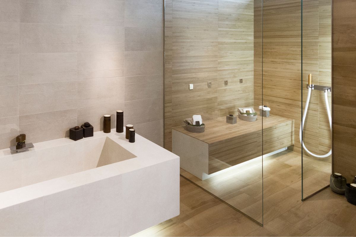
If you have no windows in your bathroom, you probably see that as a major flaw, right? Well, not anymore. If this is the case, you can wrap your entire bathroom in an interesting tile like in the bathroom here. Look how contemporary and modern it looks!
Of course, since you haven’t got a window, that means you’re lacking natural light so I wouldn’t go for anything to cool. You’ll find it looks much better to stick to warm neutral shades with a slightly lighter flooring to contrast against the tiles.
9. Mosaics For A Shiny Shimmer
Mosaics are renowned for their beauty. They originated back in the Roman times and were often used to depict stories. They were also very popular for artwork. And now they’re a popular choice for your shower tiles.
It’s such a pretty option that will add not only some light to your shower but a whole lot of shiny glimmering sparkle too.
10. Dark Drama
If you want something a little more dramatic for your bathroom, ditch the traditional white color scheme and opt for a darker one instead. And when I say dark, I mean it. In this bathroom the shower is tiled with jet black metro tiles and it looks stunning. So broody and oh so dramatic.
Contrast this darkness with some lighter accents and see what an impact it makes.
11. Play With How You Layer Your Tiles
The way you layer your tiles will have an impact on how the space appears. So it’s a pretty important thing to think about. Notice how the striking layout instantly demands your gaze?
That’s exactly what you want to happen. Who is thinking about the size of the bathroom? No one. They’re too busy staring at the shimmery smart design.
This also has a bold color which just makes it a double threat. Paired with some black and white accents, I think this has the potential to be undoubtedly stylish.
12. Blend Different Bathing Spaces
I love how much character this room has! It’s small, sure, but I think that is the very last thing that I noticed about it. The panel dividing the shower and bath transitions the two seamlessly. And the tiles of the two areas adds a beautiful cohesion.
And can we just stop for a minute and talk about the floor tiles. Wow. Here is the perfect example of a bold and vivid print demanding your attention. They are absolutely gorgeous.
13. Let The Floor Overflow
I love how the floor tiles match the shower floor tiles here. It creates a really seamless look that almost stretches out the floor. Imagine those black shower floor tiles were white, can you visualise how much that shrinks the room?
Different colored tiles would make it feel as if it was a separate section of the room and would close it up, but this really elongates the room.
The contrast between the black tiles and the light and white decor also does wonders to keep the bathroom open and bright.
14. Use A Mixture Of Tile Shapes
Believe it or not this walk-in shower is pretty small, but it doesn’t look it at all does it? This is massively down to the use of different shaped tiles.
The tiles on the wall stretch out the walls to make them feel much longer. And at the same time the very small mosaic tiles on the floor also help make the space feel much bigger.
The color, which is delightful, also helps massively. It keeps the room light and bright. And light and bright usually feels a lot larger than dark and dim rooms. This shower is so stylish it makes me want to redo my bathroom!
15. Black & White
Black and white will forever be a color match made in heaven. It is so very beautiful. I can’t think of a single instance where black and white together hasn’t looked good. And it looks fantastic in this shower room.
The light and bright tiles allude to that extra space and then those dramatic and bold tiles are so eye catching. It also adds that little bit of extra color to the room that just makes it more visually appealing overall.
Final Thoughts
Small and cramped bathrooms don’t always have to feel that way. And while I can’t gift you any extra space in your bathroom, I have hopefully provided you with many optical illusion-type tactics.
These should all make that tiny room seem a lot more open and spacious. Which one is your favourite?
- The Woodworkers Guide to Brad Nailers: Everything You Need to Know - September 25, 2023
- How To DIY An Aztec Garden Dining Table [The Easy Way] - October 18, 2022
- Farrow & Ball Pigeon: Is It Right For Your Home? - October 17, 2022

