Blue is a very popular color choice for home decor. Studies show that blue has a calming effect, so it’s the perfect option for a room in your home where you want to feel relaxed.

However, it’s important to bear in mind that there are many different shades of blue to choose from – so much so that it can feel impossible to find the perfect medium shade of blue that isn’t too deep or too light either.
The good news is that we have found what we feel is the perfect shade of blue. It’s called Can Courtland blue, and the color works perfectly in many different lighting conditions and in various different themes because of its middle-of-the-road hue.
Without further ado, let’s take a look at Van Courtland blue and discuss what you need to consider before incorporating this shade of blue into your home.
What Type of Shade Is Van Courtland Blue?
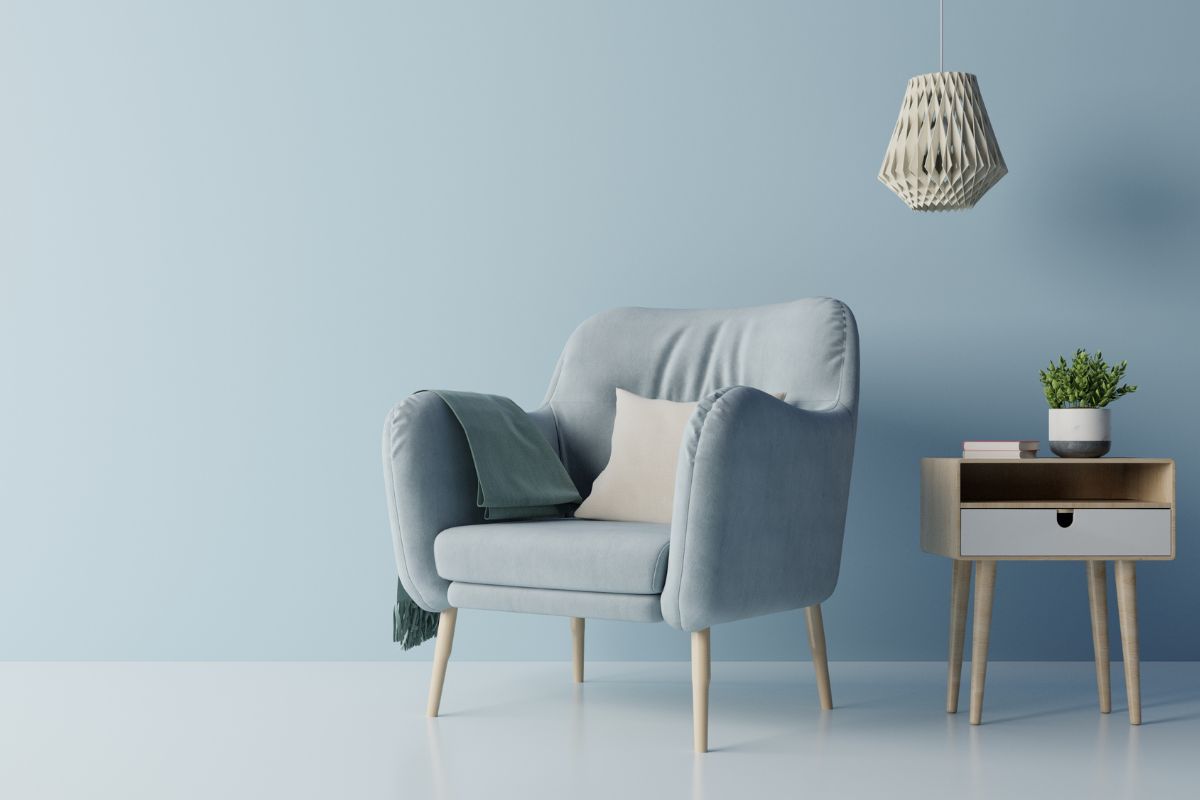
As mentioned previously, Van Courtland blue by Benjamin Moore is a medium blue shade that is neither too dark nor too light.
One of the best systems used to describe paint colors is Light Reflectance Value, which is a scale that ranks colors from 0 to 100 based on light. 100 would be a white color whereas 0 would be black.
Van Courtland blue has a rating of 31, which means that it’s closer to white than it is to black, but it’s not a ‘barely there’ type of blue.
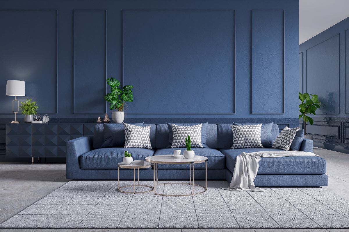
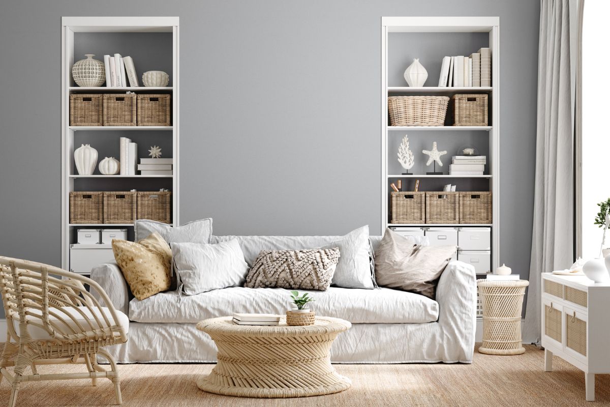
Van Courtland blue is a strong yet elegant Old World gray-blue color. While the ‘gray’ part of that description may not sound very exciting for some, rest assured that the blue in the shade comes through beautifully, especially in bright light conditions.
Is Van Courtland Blue Right For Your Home?
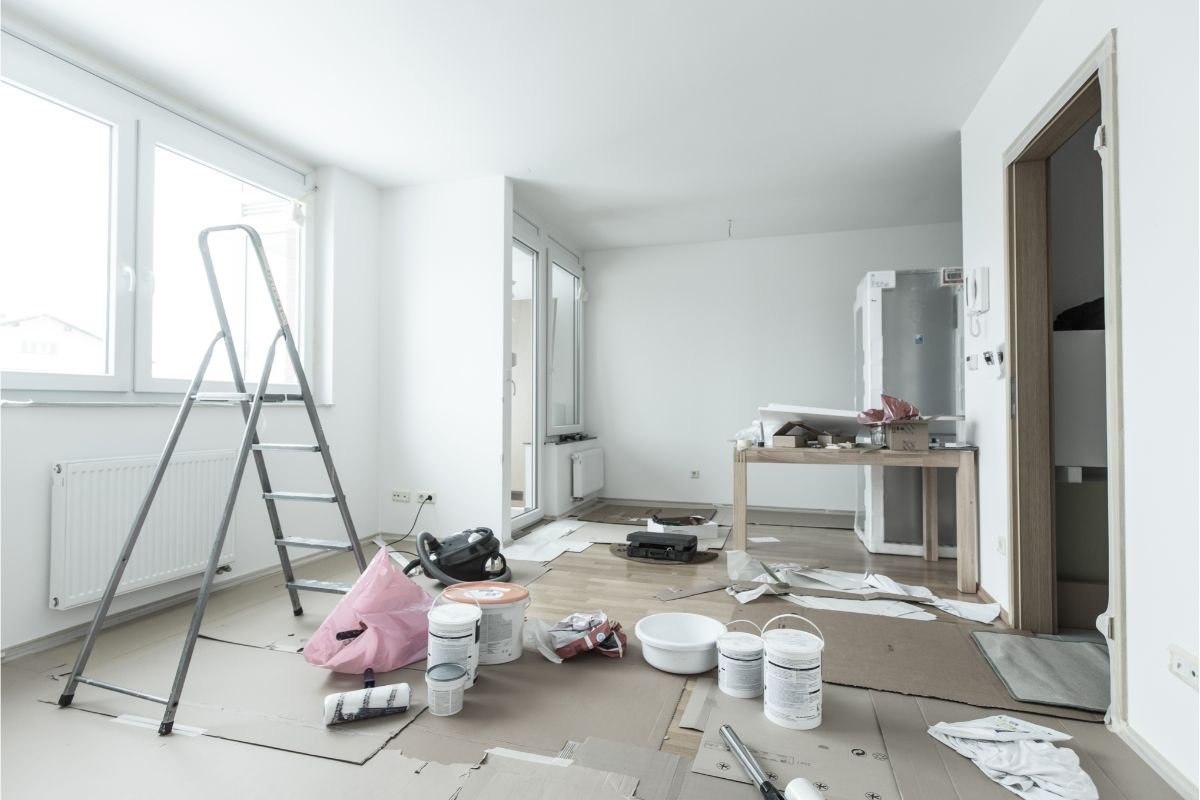
No matter how good a shade of blue looks on paper, you should never just start painting without carefully considering how the shade will look in your home.
There are a few different factors to consider when you do this and several different methods of visualizing how Van Courtland blue will actually look on your walls or furniture.
Lighting Conditions
The first thing you should bear in mind if you want to know whether Van Courtland blue is the right shade of blue for your next decorating project is that different lighting conditions can make all the difference.
There’s no denying that Van Courtland blue looks great on the color charts, but depending on what the lighting is like in your home, you might find that it looks completely different from what you envisioned before you painted, so the point that you might not even like it anymore.
Remember , Van Courtland blue is 31 on the Light Reflectance scale (100 is white and 0 is black), so while it’s not an overly dark blue, it’s not light enough to work in very dimly lit spaces.
The less light you have in a room, the darker your chosen color will look. So, for instance, if you want Van Courtland blue to appear vibrant, but you only have a single window in the room you want to paint, it might not be the best choice for you.
Similarly, if you wanted a very deep-looking blue but the room you want to paint is always flooded with natural light, you might want to opt for a naturally darker blue.
Color Comparisons
It’s always a good idea to compare your chosen color with other colors that resemble it before making your final decision.
Doing this will help to ensure that you make an informed choice. After all, you might think that Van Courtland blue (Also check out Van Deusen Blue) is the perfect shade for your home, but after comparing with other colors, you might find one that you actually prefer.

This will also be a useful process if, after checking the light conditions in your home, you realize that you need either a lighter or darker shade because you’ll already have options to consider.
Mood Board Planning
We have found that one of the most effective ways to figure out whether a specific color will work well in your home is to plan the changes you want to make using a mood board.
A mood board not only helps you to visualize what you want an area of your home to look like, but it’s also a helpful way to see how different colors work together beyond basic color charts.
Even if you make a chart of all the different colors you want to incorporate in a room, it might not be an accurate representation of what the colors will look like in the form of furniture or alongside other features in the room, so a moodboard is often a more effective way to plan your decorating.
Test Swatch
If, after making a mood board, checking your light conditions, making a mood board and comparing Van Courtland blue to other similar shades, you have decided that you still want to use it, you should make absolutely sure it’s the right shade using a test swatch.
However, don’t be tempted to paint a square of Van Courtland blue right onto your wall as the current color will impact the result, and if you don’t like it, you’ll just be complicating things for yourself later on.
Instead, take a poster board in pure white (no undertones) and paint a larger square of Van Courtland onto it before sticking the board to your wall using painter’s tape. This will give you a more accurate idea of what the color will look like on your wall.
Van Courtland Blue Undertones
One of the most-asked questions regarding Van Courtland blue by Benjamin Moore is whether or not this shade of blue has any undertones.
After all, if a color has undertones of a different color, it might impact how well it pairs with other hues and how it will look when painted over an existing shade.
Thankfully, with Van Courtland blue, you don’t have to worry about any undertones because there are none. This makes it an easier shade to work with compared to some of the green-blue shades that are popular for home decor.
It does have a slight grayness to it, though, especially in dim lighting, so be sure to bear this in mind, especially if you don’t get a lot of natural light in your home.
Trim Colors For Van Courtland Blue
If you’re wondering what trim colors to use alongside Van Courtland blue, the good news is that this shade of blue is a fairly versatile color that looks great with a variety of different trims.
A simple off-white will work perfectly with Van Courtland blue, but if you want to make the color pop a little more, we recommend a crisp white instead for a clearest contrast.
Various shades of brown can work as well, and you might even want to try out a pale peach if the off-white isn’t quite working for you.
Your trim color is another shade you’ll want to test out beforehand during the swatching process. We recommend painting both colors side by side onto your plaster board so that you can see how they interact on your wall before you commit to the color combination.
Final Thoughts
Van Courtland blue is a versatile, medium blue-gray color with no undertones that’s perfect for spaces where you want to instill a sense of relaxation and neutrality without sticking to bland or boring colors.
This shade of blue by Benjamin Moore works well with various trims, ranging from off-white to brown.
You can easily test out the suitability of Van Courtland blue and your preferred trim colors for your room by comparing similar shades, making a mood board, and using a plaster board to test out swatches.
- The Woodworkers Guide to Brad Nailers: Everything You Need to Know - September 25, 2023
- How To DIY An Aztec Garden Dining Table [The Easy Way] - October 18, 2022
- Farrow & Ball Pigeon: Is It Right For Your Home? - October 17, 2022

