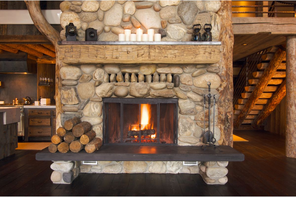
There is no one “right” way to decorate your home office, but there are so many good ideas out there. Get inspired with these gorgeous home office paint colors and help you find the one that suits you the best.
The right paint color can transform a drab space into one that is functional and fun. This is why it is so important to learn the various types of paint colors.
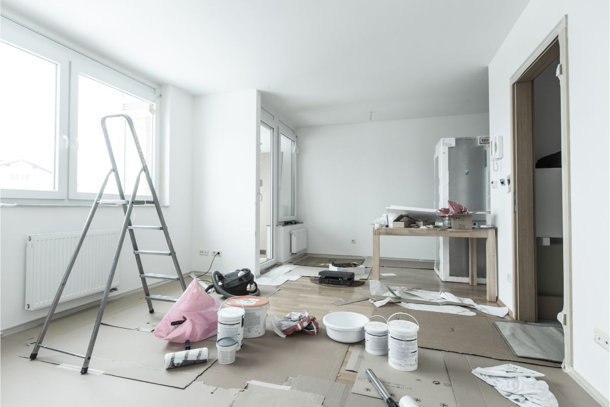
Depending on whether you want simplistic, out there or luxurious, the paint you use can make all the difference.
How Should Your Home Office Feel?
A home office is a very personal place that should be both functional and inspiring. We’ve created some tips to help you make the most of your home office, whether you’re a stay-at-home parent, a solopreneur, or an entrepreneur.
How should a home office feel? The office can be anything, from a spare room to a folding table in the garage. How you design and furnish your office is key to your success.
Color is also something you need to think about. You need to think about the mood and how color can set that mood.
Your decor including your paint can also help improve your mood and the office can become your own sanctuary. However, this needs to be customized for you and what will make you relaxed and comfortable.
Most people tend to love the darker tones in their study because it tends to relax people more.
1. Best Yellow
- Yellow is a color that many people associate with happiness, joy, and sunshine. It’s also sometimes referred to as ‘the color of sunshine’ or ‘the color of happiness.’
- It can also be a really motivating color for some people which is ideal for people who are working a lot in their studies. It is warm and people love to feel that warmth when they are at home because it can be very calming.
2. Black
- This is the ideal color to shut off the rest of the world and just focus on what is going on in your study. Black studies are becoming very popular because it is very cozy and is easy to match furniture colors with.
- It is such a blank page to do whatever you want with which is what many people love. It makes the job of interior design easier. For you.
3. Gray
- Gray color is a very cool and trendy color for the summer season. Here we have collected some unique and creative ideas with gray color and how to use them in your home, office and personal life.
- Gray is a neutral color, so it works well for many different designs and styles. You can find a bunch of gray products in all sorts of shapes, sizes, and materials. It goes with everything and creates a lovely simplistic feel.
4. Blue/Gray
- Blue-gray color is a warm color used in a wide range of interior design of homes, offices and other buildings.
- The light blue-gray color is generally used to represent the color of the gray-blue in the area of the sky just before sunset.
- Different types of blue shades are used for different feels, but the soft blue-grays are for calming feelings.
5. Best Green
- Green colors are great for an earthy feel as if you are at one in a nature environment which can make people feel much better in a working situation.
- Darker green tones can be viewed as quite dramatic and bold and create a real statement for your room. Green tones have become very popular – especially for smaller rooms like studies because they create a fresh but organic feel.
6. Red/Orange
- This is one for boosting your mood day in and day out which is necessary for this type of room and what you will use it for.
- The color red and its orange cousin are two of the most noticeable colors on the spectrum.
- Both colors are bright, energetic and passionate. For this reason, many people associate red and orange with positive emotions, such as love and joy.
- The navy color is a very popular color, which is used in a lot of different types of decor and even for exterior paint jobs on your home. The best part is that it’s very easy to find, because it’s one of the most common colors used.
- It is a motivating but calming color which can make your room much cozier.
- This will also make your office look neat and important if furnished correctly.
8. Teal
- The color teal has become quite popular in recent years. This color is one of the most beautiful and striking, and it has become a staple of many fashion trends.
- Blue is the most popular color in the United States and the second most popular color in Europe. It is often associated with loyalty, alertness, and authority. But it is not the only teal color. There are a number of different shades of teal.
- The teal color can be seen in many shades of blue and green . Its distinctive color is due to the specific wavelength of light that is reflected from it and can make a room feel bigger and lighter.
9. Tate Olive
- If you’re looking for a new shade of olive, you don’t have to look far. Our simple guide to different types of olives makes it easy for you to find a shade that fits your lifestyle.
- It has become more popular because it brings a sensual feel to a place where a lot of stress might occur.
10. Silhouette
- This has the perfect mix that isn’t too in your face but it isn’t too bland and boring either, it is just right. It is a perfect plum hue and is not purple.
- To be able to use this type of color you need a room that has plenty of light coming through to make sure it isn’t too dark.
11. Aqua And Turquoise
- Blue and green hues bring a sense of calm, relaxation and peace to the home and work environment. Aqua and turquoise hues are also very attractive for decorating your home or office.
- Clear, sparkling aqua glass and turquoise decorative glassware are a popular combination with this wall color, adding to the calmness created.
12. Terra Cotta Tones
- Terra cotta paint is a beautiful natural product that can create a variety of finishes and color tones for your home.
- Terra cotta paint is a unique paint that has a matte finish, easily stains porous surfaces, and is resistant to heat and cold which are some extra benefits.
- It might seem a bit boring but you can make it exciting and simplicity is sometimes a winner.
13. Light Pink
- Light pink color is a bright and bright pink shade of pink. It has a cool feeling and a pure, elegant feeling and is usually
- It is usually viewed as a very feminine color but it doesn’t have to be. It is a light and delicate color which will make your study feel motivating but also quite peaceful.
14. Deep Blue
- The deep blue color is a gestalt perception of the sea and sky, which appears when the blue of the sea and sky are combined to create a slightly greenish blue.
- Deep blue color is one of the most beautiful colors that can be seen in nature. I love how the sky is blue and the lake is deep blue. The deep blue color can be found in the water, the sky, and even in the earth which can be transferred onto your walls. A study is a place for concentration or relaxation which is why many people go for this color.
15. Icy White
- White is always a go if you’re someone who doesn’t want to be too bold or have no idea what colors go together. However, icy white is the perfect color to use with other colors. It is a blank page to create whatever you want.
- You also need to accessorize your white walls with paintings or clocks so it is not too bare.
- White is also a great option for people who like their office to be a place where they can get some good light because it makes them feel more awake and ready to work. Everyone is different which is why there are so many options.
Mixing And Matching
Putting different colors together can be quite daunting but is a good bold and modern look if you get it right. You have the more regular mixes like black and white, but using a different color from this list could really create something that is more you.
It can also create different looks in every room but can also allow you to have a color running through your home if you want that is a bit different and unique. Most people nowadays like something a bit different and not just the norm for a study.
Conclusion
Overall, Study decor colors and make your study a study space worth studying in. There are many things to consider when choosing the right colors for your space, including lighting and the color palette.
Study design is an important part of the research process. It’s important to have colors that help promote positive mood, productivity, and relaxation.
Decorating a study space can make all the difference in the world when you are trying to study or work.
There are plenty of ways to jazz up a boring space with just a bit of paint and some accessories you can add to really spice it up and help it match your personality and who you are.
The great thing about decorating your study is that you can be as creative and as colorful as you like and also make your space unique and somewhere you enjoy going, it helps lift your mood.
Frequently Asked Questions
What Color Should I Paint My House For When I Study?
When selecting a paint color for your home, you need to consider the purpose of your living space. You need to take into account the features of your home and the overall atmosphere of your home.
You need to think about whether you want it to be a cozy room, or have a bigger feel with a simple look. People tend to go with softer colors for a cozy feel or richer colors. Lighter colors tend to make the room feel bigger.
What Colors Go Well With Blue Walls?
There are many ways to make a space feel welcoming and bright. From the color and texture of the walls to accessories and furniture, there are so many ways to transform a room to feel more welcoming and have more visual interest.
- The Woodworkers Guide to Brad Nailers: Everything You Need to Know - September 25, 2023
- How To DIY An Aztec Garden Dining Table [The Easy Way] - October 18, 2022
- Farrow & Ball Pigeon: Is It Right For Your Home? - October 17, 2022


