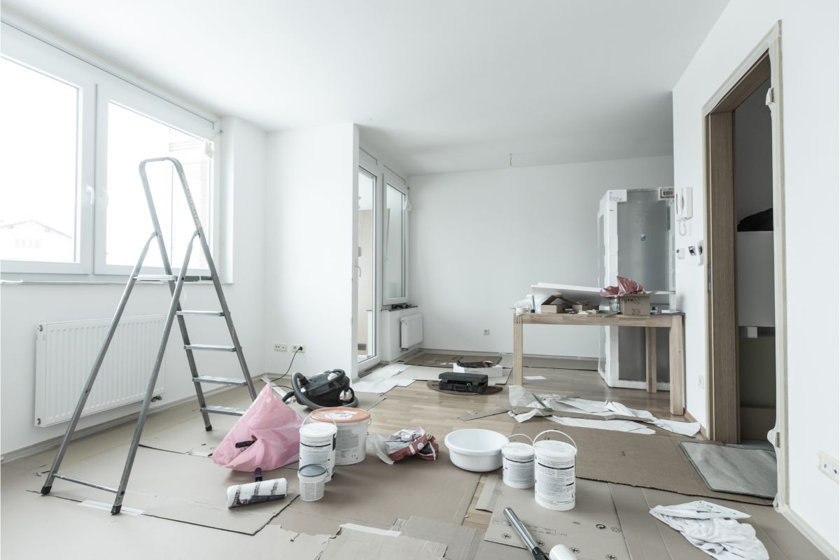
Choosing the right paint color for any space in your home is a much more difficult task than it might seem. There are so many different shades of each color that each provide a different tone or feeling to the room.
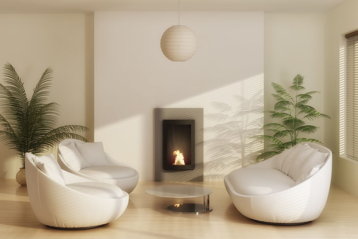
Some shades are warm, some are cool. Some colors go with your furniture better than others. The finish of the paint is another question altogether.
Before you get completely overwhelmed by the task of choosing paint, we have taken some of the hard work out of the decision.
If you are considering alabaster as a paint color for the space that you are decorating, we have asked and answered some of the most important questions in this article.
What Color Is Sherwin Williams Alabaster?
This might seem like a bit of an odd question but bear with us, Sherwin Williams Alabaster is obviously alabaster. However, because of the nuances of paint mixing, the color of the alabaster paint can vary slightly between different brands.
To be technical about it, alabaster is classified as an off-white color. This is because the yellow undertones of the color are too strong for the shade to be classed as white.
The best way that you can tell the difference between alabaster and white because they are so similar, is to compare it directly to a color that is classed as true white.
In keeping with the Sherwin Williams colors, a good comparison is the High Reflective white shade. You will be able to see the differences in undertones between the two colors. That is what makes alabaster off-white instead of true white.
What Is The Undertone Of Alabaster?
As mentioned briefly above, alabaster is not a true white color which means that it has an undertone. The undertone in alabaster is yellow.
It is important to know what the undertone of paint color is when trying to choose it for your home because it affects the ability of a paint to match with other colors.
Despite the fact that alabaster is a form of white paint and, therefore, should technically go with most other colors, the yellow undertone affects that.
Because it is not a true white paint any colors already in your space that will clash with the yellow undertone will make this paint unsuitable for that room.
How Do You Know If Alabaster Is Right For Your Space?

There are a few simple steps you can take to make sure that you are confident in your decision that alabaster is right or wrong for your space.
Below we will cover the easiest and most effective ways to test whether alabaster will work for your space alongside your other colors and furniture.
Observe Your Light
One of the most important things to do when testing a paint color is to observe the light in a room. The type of light that you get in a room significantly affects the appearance of the paint that you choose.
For example, in a room that gets plenty of natural light, Sherwin Williams Alabaster will look more like a pure white color.
In a room that gets a typical amount of natural light, for instance, it has regular sized windows rather than floor-to-ceiling ones, the alabaster will look like the soft white shade that it truly is.
If you have a space that is mostly lit by artificial light or very little light at all, you will be able to observe much more of the yellow tone. Depending on what you want from the alabaster paint, it can work in any of these rooms.
However, it is important to understand that there will be differences based on the amount of light and type of light.
Test Out A Sample Properly
You never want to commit to a paint color without sampling it on your wall first. However, it is equally important to make sure that you sample the paint properly.
If you fail to test a sample properly you can end up with disappointing results. If the space you are testing in already has a pure white color on the wall, you can go ahead and paint the common small patch of color to test.
Remember that you should ensure the color is actually pure white and not off-white.
If your wall is not pure white or is a different color altogether, painting a small sample onto the wall won’t give you an accurate representation of what it will look like if you paint the entire room.
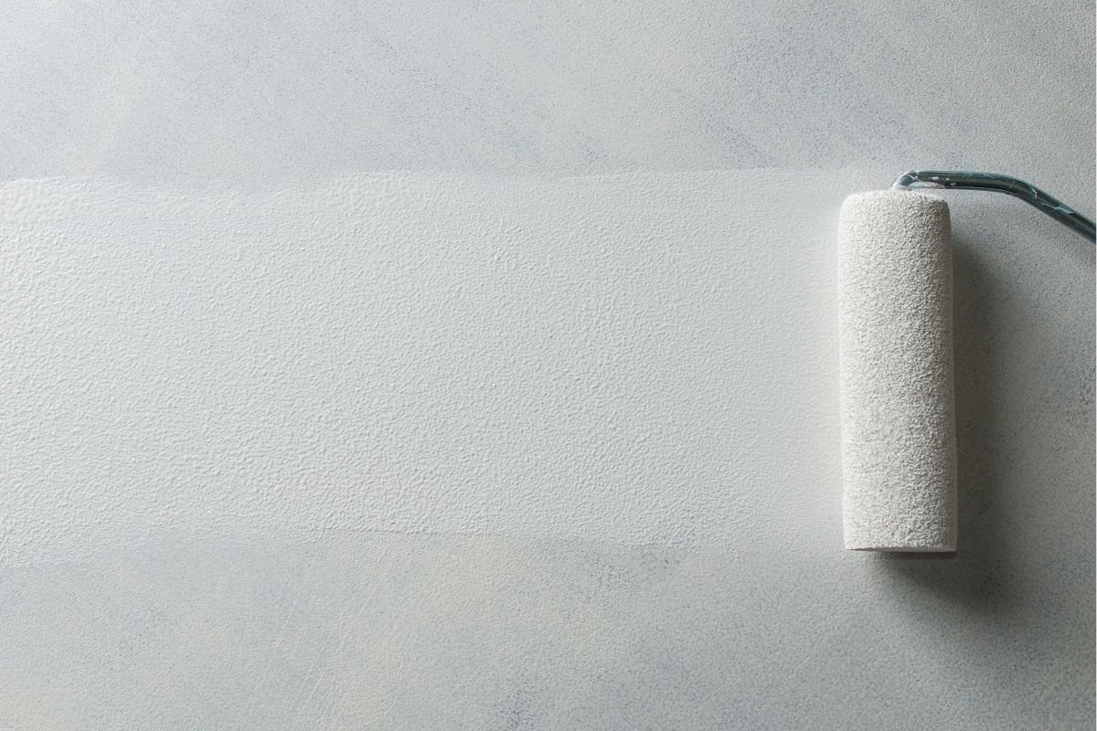
Instead, you should get the peel and stick samples and place them onto a white poster board. This will give you a more accurate picture of what the undertone of the paint really is and what it will look like in the space that you are looking to paint.
Alabaster Vs White Dove
Alabaster and White Dove are both off-white colors that are good to compare against the same white poster board. Both of these shades are incredibly similar, however, the undertones are ever so slightly different.
The Alabaster has slightly more yellow undertones, whereas the White Dove has some yellow and some gray. This makes the White Dove much easier to work with.
Alabaster Vs Cloud White
Cloud white is an off-white shade that is as close to cream as you can get without straying into cream territory. When comparing these two colors, Alabaster is the easier of the pair to use with other colors.
Cloud White has a tendency to make your walls or trim look muddy rather than creamy which isn’t desirable.
Alabaster Vs Snow Bound
Again, both Alabaster and Snow Bound are off-white shades. However, Snow Bound actually has purple undertones. This, again, makes it a more difficult shade to work with than Alabaster.
The purple undertones can drag down the colors of a room.
What Colors Go With Alabaster?
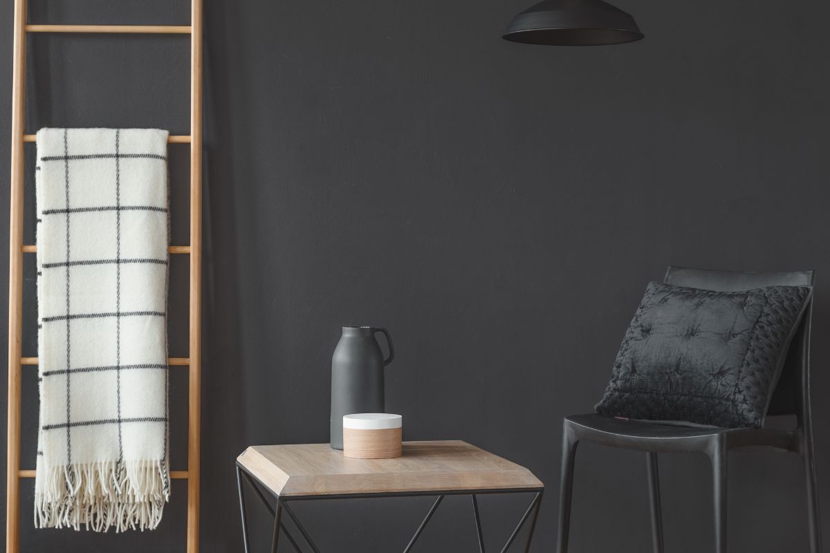
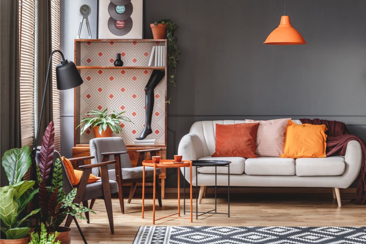
As a general rule, Alabaster matches well with colors that have warmer tones. Warm grays can work especially well with this color. Similarly, it can work well with certain darker tones such as very dark grays and even dark greens.
The most important thing to remember is to properly test any and all colors that you are planning to use in your space.
Frequently Asked Questions
Does Alabaster Go With Gray?
As alluded to above, Alabaster can work incredibly well with gray. However, it is important to ensure that the undertones match properly. Because it isn’t a pure white color, Alabaster won’t always work well with every shade of gray.
If you are going for a more muted look with more neutral tones rather than looking to make any color pop, it can work very well with warmer-toned grays.
If you do want more of a pop, choosing a dark gray with blue or even green undertones can create a stunning effect.
If you are looking to use a gray color alongside Alabaster, ensure that you are properly testing the intended gray next to the Alabaster. As we mentioned above, not all colors or shades of color work well with Alabaster.
Therefore, if you don’t test your samples properly, you can end up with a space that just doesn’t look quite right with the shades you have chosen. There is no need to rush the sampling process, it is worth it in the end.
Final Thoughts
Alabaster is an off-white color that can work perfectly well in any room or space. However, it is important to remember that the lighting of a room has a significant impact on how a color such as Alabaster will look on the wall.
It is important to test the colors that you are using with the light that is most commonly used in a room before deciding on the color to know whether it is right for your space.
- The Woodworkers Guide to Brad Nailers: Everything You Need to Know - September 25, 2023
- How To DIY An Aztec Garden Dining Table [The Easy Way] - October 18, 2022
- Farrow & Ball Pigeon: Is It Right For Your Home? - October 17, 2022

