It’s funny, isn’t it? How things swing in and out of fashion. From clothes to cars, to hair do’s – there’s always a particular style or trend to follow.
And even colors are no exception to the fluid and fast-moving nature of fashion.
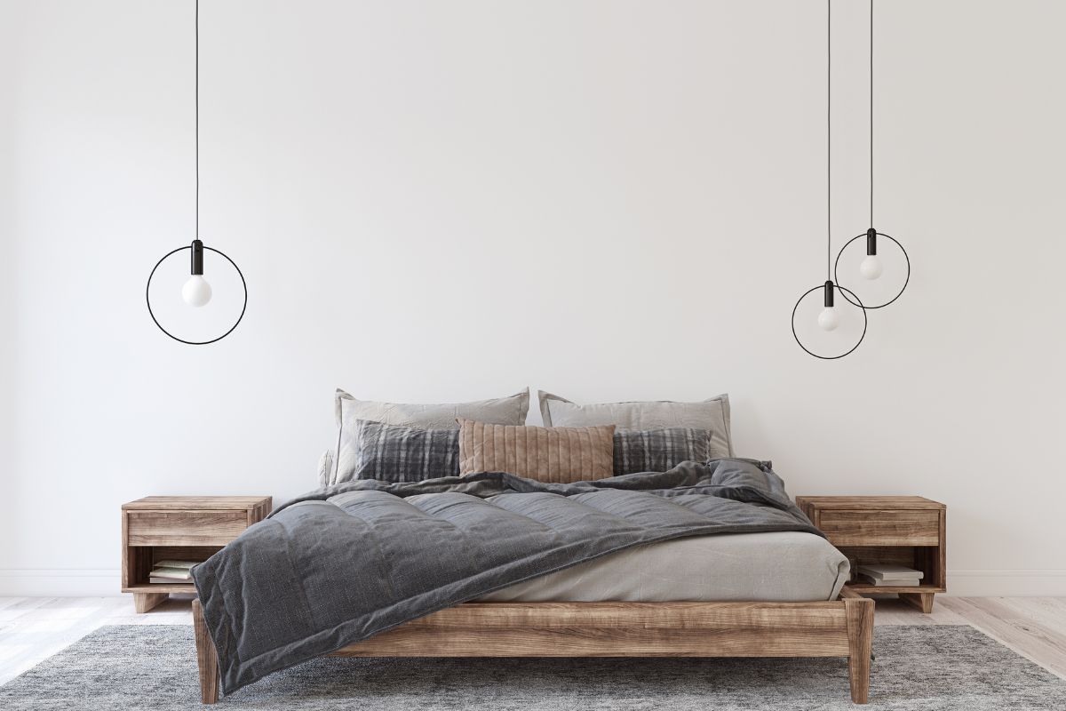
It seemed like only yesterday that grays were the in thing. From sofas to walls to wardrobes, every home was covered in that sleek gray color.
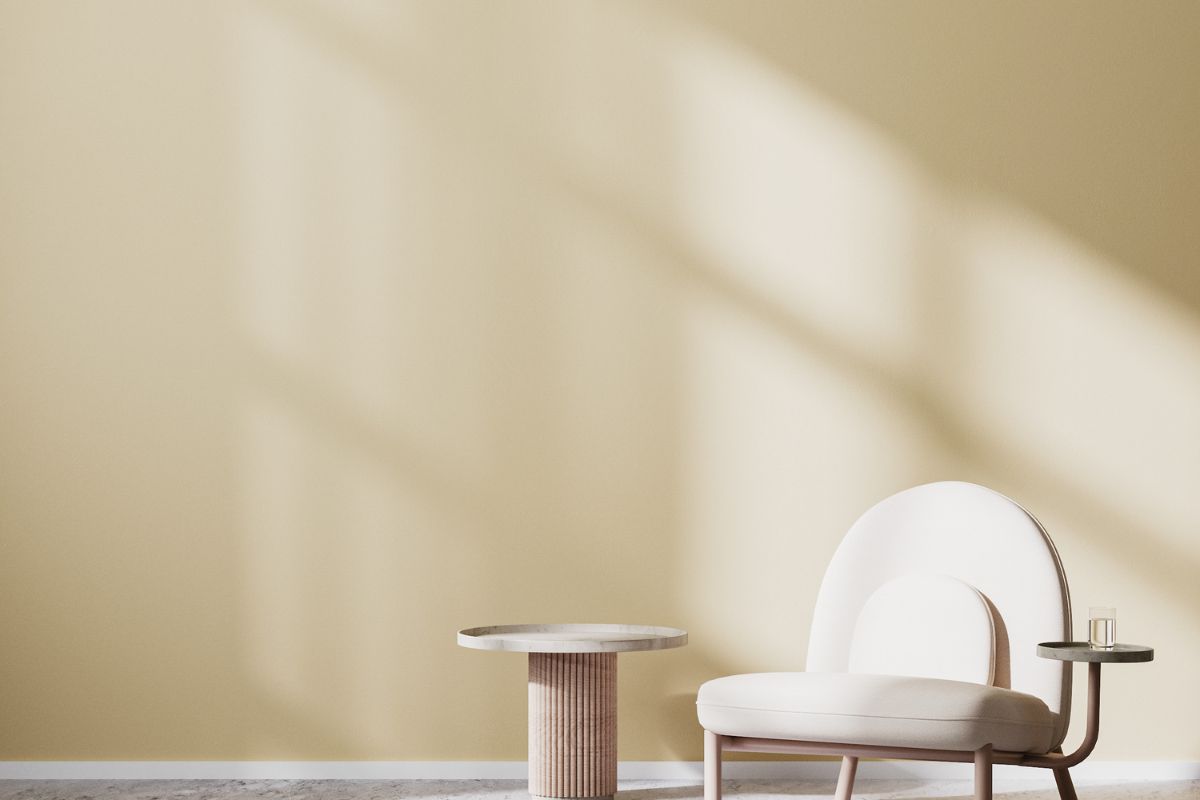
However, nothing reigns supreme for too long, gray has been kicked off its pedestal, and there’s a new top-dog color on the block. And that is beige. I can’t lie either, I’m so here for it.
Beige goes with pretty much everything. Sherwin William’s Accessible Beige is arguably the best beige option for any home. And I’m going to spend the rest of this article, converting all my non-beige believers.
So without further ado, let’s jump into the ultimate guide to Accessible Beige!
What Are Accessible Beige’s Undertones
Accessible Beige has quite the reputation of being one of the best neutral paint colors available on the market.
And I think this is because it’s beige without being too beige. It doesn’t have that real yellow undertone that you’ll find in the majority of beiges.
It does, however, have this kind of muted greenish undertone that you won’t always see, but is quite apparent when beside colors that contain a pink undertone such as terracotta tiles.
Like I say though, it isn’t an apparent and glaringly obvious undertone, so there’s no need to panic. It is quite muted, indeed.
Is It A Warm Or Cool Color?
Considering the greyish greenish undertones that can be seen in Accessible Beige, you’d probably assume that it is quite a cool color. But it’s not.
Accessible Beige is actually quite a warm color in your home. Of course, ample natural light, or lack thereof will warm up or cool down the color in your house.
You’ll tend to find that in north-facing rooms where there really isn’t any access to natural light the color has a more gray-colored appearance which looks a little cooler.
However, rooms, where the sun can shine in on Accessible Beige, will be much warmer in appearance.
What Colors Go Well With Accessible Beige?
The very first step when picking which colors will work well in your home is to consider the fixed elements in your home. I’m talking about your trim, your counters, and even the floor.
You want something that is going to match with these – and luckily Accessible Beige matches with just about everything.
A true white color is always a great option to complement Accessible Beige. However, true white colors are hard to come by. They very often will have hints of gray or beige or yellow.
Benjamin Moore’s Simply White is a perfect option. Or if you are looking for something a little softer, you should consider Benjamin Moore’s White Dove. Both of these colors go amazingly with Accessible Beige.
One thing to watch out for is if your flooring has pink undertones. If it does, I wouldn’t really recommend Accessible Beige as you’ll find that those undertones bring out undesirable undertones in the paint color.
It’s always a good idea to try and test out how your paint will look next to your flooring. It’s often forgotten about, but it can actually have a massive impact on how the color will appear.
My favorite color combinations with Sherwin Williams’ Accessible Beige are:
- Fawn Brindle – This is a dark gray color that also has a slight green undertone
- White Dove – This is a soft white color that has a greige undertone
- Iron Mountain – This is a dark brown to blackish color.
Other colors that also look great are:
- Evergreen Fog
- Hale Navy
- Charcoal Gray Navy Colors
- Bronze Colors
Tips For Painting With Accessible Beige
1. Don’t Go Off The Paint Chip Sample
The main mistake that many people make when picking their paint color for a room is to just go off the sample.
The color looks lovely on the sample, and then once the whole wall is covered, the final product isn’t quite what was hoped.
This is because you can’t see how well a color will work from such a small sample.
And painting a small amount over your wall won’t work either because the color behind it will influence its true hue and undertones unless it is a true white.
Instead, what you are best doing is purchasing a small sample-size paint tub and then painting a 12×12 white poster board with your chosen color.
Leave approximately 2inches of the poster board white still too. This way you can get an accurate representation of what the color will look like.
2. Compare Accessible Beige With Other Colors
Even if your mind is made up and your heart is truly set on a color, you should always compare it with other colors that are similar shades.
This way you can see which one works best in your home with the fixed elements such as flooring and counters.
You may love the color in store but your home may bring out different hues and undertones that make you reconsider.
And if nothing else, then those other colors can just further prove to you that Accessible Beige is definitely the color for you.
3. Think About Lighting
I cannot stress this one enough. You must consider the lighting in your room before you paint it. And this isn’t just for Accessible Beige – but for any color.
Lighting influences the appearance of a color. It’s unavoidable, it will happen, and so it must be considered.
Because of the undertones in Accessible Beige, it can come across as a real true beige in some lighting whereas in others it can look a lot closer to gray.
A south-facing room will tend to have more natural light and so will be closer to a true beige whereas in really dark rooms that have no natural light the color can look a lot darker, and can sometimes even appear as more of a brown color.
So you need to check the color in natural light and lack thereof, as well as checking what it looks like once you have your lights in the rooms turned on.
4. Don’t Base Your Decision On Seeing It In Another Home
Accessible Beige is a great color, and I absolutely adore it. But with that being said, I think it is still really important to note that a color will look different in each and every room, let alone each home.
You should always get your own sample and test out how the color will look in your home before you speed off to the store to purchase the paint.
Typically, Accessible Beige will look great in homes that have access to a lot of natural light, but if your home doesn’t it may look a little dark.
5. Always Compare The Color For Your Walls To The Fixed Elements In Your Home
Picking a paint color for the walls of your home is a fairly simple and easy job. Ripping up your flooring or removing your countertops…not so much.
You will want to work your paint color around the fixed elements of your home. Because if it doesn’t match those items that you can’t change, you’ll have a room that doesn’t look pleasing.
And it’ll cost you a lot more time and money to change those permanent fixtures than it would your pain color.
Frequently Asked Questions
Will Accessible Beige Look Good In Open Concept Homes?
If you have an abundance of natural light in your home then Accessible Beige will probably be a great option for you, providing that it matches with the other elements of your home such as the flooring and lighting.
However, if you do not have access to much natural light, I’d opt for a different color otherwise you’ll have a much darker and browner colored home than you initially anticipated.
Accessible Beige Vs. Revere Pewter
I often get asked which will work best, Accessible Beige or Revere Pewter. Both are very popular neutral paint colors that are increasing in popularity.
When you compare the two side by side, the first noticeable difference is that Accessible Beige is a much warmer color with more beige tones than that of Revere Pewter which looks a lot darker.
However, both colors contain grayish undertones and when comparing them from just the paint chips it can be quite difficult to really differentiate between the two.
And the answer to which will work best for you really depends on your home. The fixed elements within it, the lighting, and the general interior design.
The only real advice I could give s to get samples of the two colors and compare them in your home.
See which brings your room to life more than the other and which hues are more desirable for the appearance that you are trying to achieve.
Accessible Beige Vs. Agreeable Gray
Both of these colors come from the same family of grayish beige color which is known as greige. However, when you compare the two side by side you can notice quite a difference between the two.
Accessible Beige tends to be a neutral color that is naturally beige with a gray undertone, while Agreeable Gray is the exact opposite being a neutral color that is naturally gray with a beige undertone.
Accessible Beige is definitely the warmer color out of the two. Neither are exactly cool colors in my opinion, but side by side it is very apparent that Accessible Beige is much warmer than Agreeable Gray.
Final Thoughts
Accessible Beige is a wonderful color for any home that has a lot of natural light. It goes great with true white colors as well as greenish colors such as Evergreen Fog due to its underlying green hue.
However, without that access to light, the color can come across as quite dark. So this should always be considered before you pick up that paintbrush.
You should always pick a sample to ensure that you are happy with the color before you start painting.
But the color is really beautiful so I would definitely recommend giving the sample a go to see how it will look in your home.
- The Woodworkers Guide to Brad Nailers: Everything You Need to Know - September 25, 2023
- How To DIY An Aztec Garden Dining Table [The Easy Way] - October 18, 2022
- Farrow & Ball Pigeon: Is It Right For Your Home? - October 17, 2022

