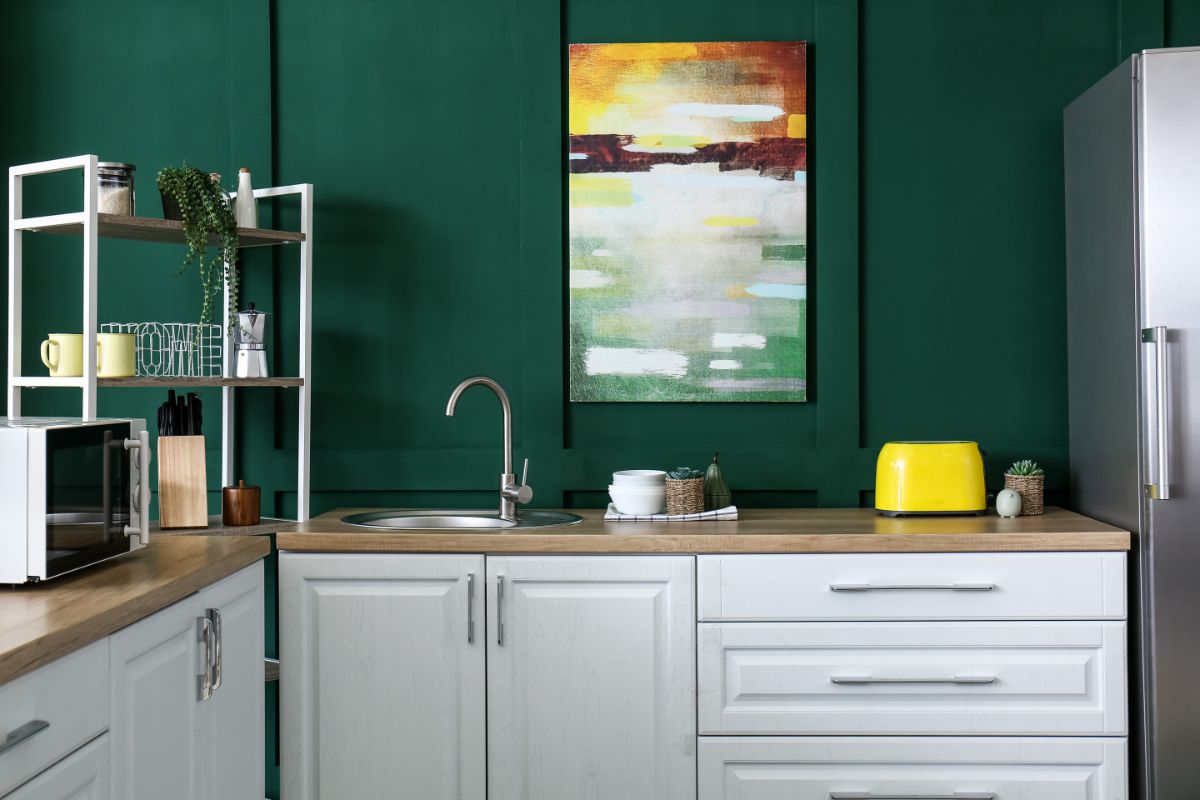
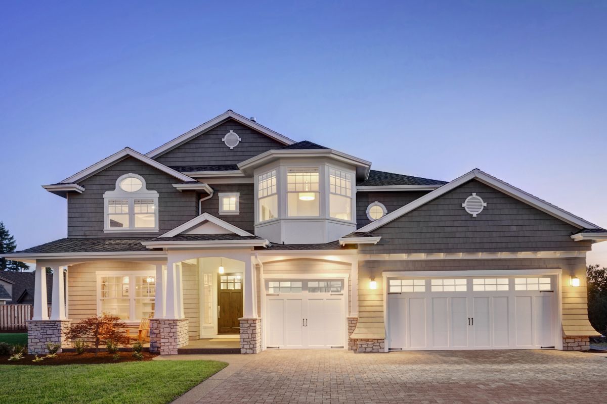
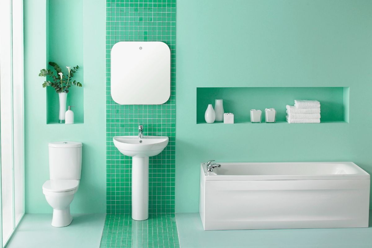
I think a lot of the time we always focus on decorating the inside of our homes. After all, that’s where you spend the majority of your time. However, you should definitely consider decorating the outside of your home too.
And if you pick the right color combinations, painting the exterior of your home will have passers-by driving past green with envy.
It’s pretty crazy how just a lick of paint can really transform the outside of your house. It makes it look much prettier and can even make it look a whole lot more expensive. So it’s definitely worth doing.
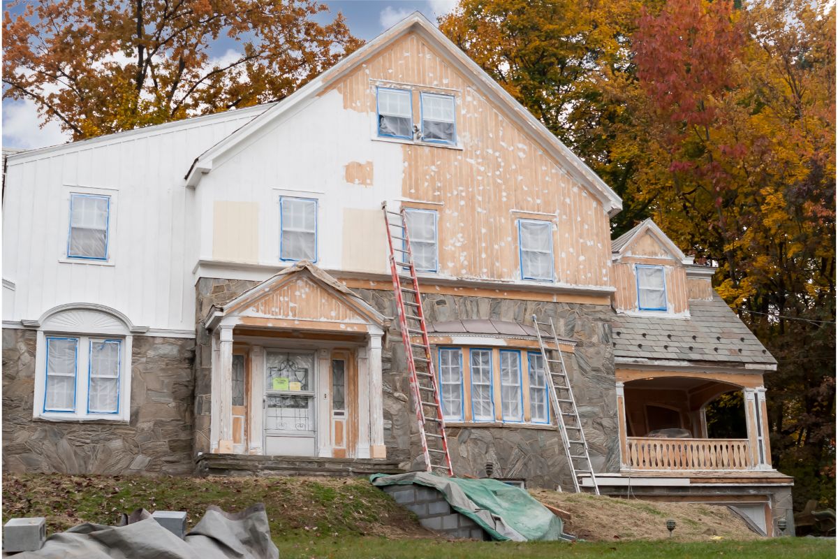
But what are good color combinations? Well, you’ll want to consider how the siding, trim, front door, and other exterior elements all mesh together.
But don’t worry, I’ve done all the hard work so that you don’t have to.
Throughout this article, I’ll be listing all my absolute favorite color combinations. So take a scroll through and see which ones appeal the most to you!
Exterior Color Combinations
1. Black, White, & Aqua
Oh, do I love this combination. There’s something so simple and yet so elegant about the white and black color combination with that small burst of pretty color.
For this combination, I’d opt for black siding and paint the trim of the house white so that the majority of the outside of your house is black and white.
The white trim also tends to highlight the architectural features of the home and prevents the black from making the front of your home dark and dingy.
And then for the cherry on top, you’ll add a burst of a gorgeous baby blue or aqua color. This gives the house that extra pop and such a small detail actually becomes the best feature.
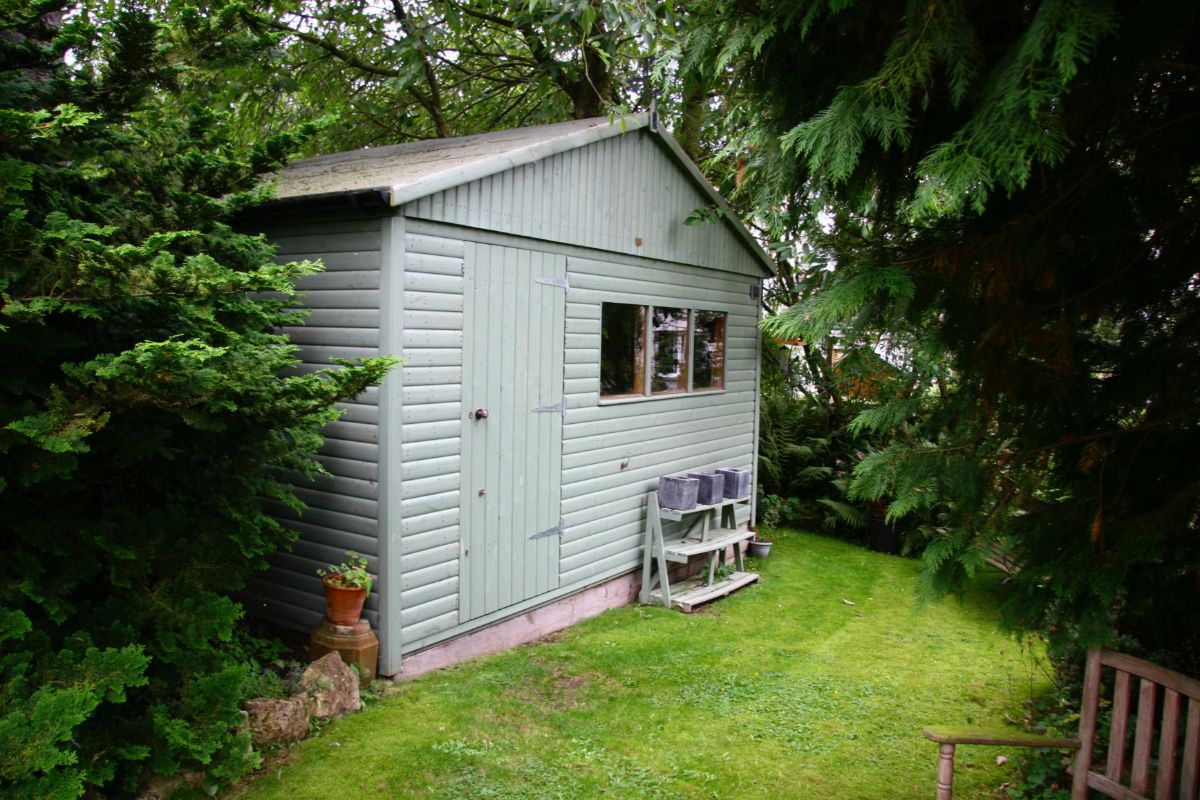
2. Hunter Green, Muted Sage, & White
It’s amazing what adding another color can do to the appearance of your home. I absolutely love the Hunter Green color but if you painted your entire exterior this color you’d have a very dim, dark, and uninviting home.
It needs a little something more. That’s why I always advise the white trim to lighten it some.
However, I don’t think that the white alone does the job.
But adding that beautiful light and gorgeous sage green color opens it up so much. A matte finish helps to really tie the two non-neutral colors together too.
If you have a fence surrounding your home, I’d opt to paint it the Hunter Green shade rather than matching it to the white trim as it’s less harsh on the eyes and really emphasizes that sage color on the door.
3. Soft Lime, Powder Blue, & White
Now, this might sound a little out there, but you’ll just have to trust me with this one. But the result is so cute.
It’s very magical and whimsical. Perfect for those who want to feel as if their home should be found inside a fairytale.
This works best for those that have lots of landscaping or forestry around the home, as the lime green of the house blends in seamlessly with the greenery around it.
The powder blue doors and front steps add a playful aspect to the home, and they complement each other really well.
You’ll want to pick lighter shades rather than bold and bright though, or the color scheme tends to clash.
These light shades blended together with white trim will look so adorable and unique it’ll be sure to have people staring back at the house as they drive by.
4. Pearl Gray, Slate Blue, & White
This look is a little more understated than the one above but is equally as beautiful. For those who want a look of elegance without standing out too much this color combination is perfect.
This color palette is perfect if your home is surrounded by stone and concrete as the colors blend in with the surroundings perfectly.
The gray siding and white trim go perfectly together, and that hint of slate blue for the door is a really subtle color change, but it makes all the difference.
This is the perfect look for a more modern home.
5. Lavender, Purple, & White
Do you not find that lavender and light purple colors have such a calming effect? One glance at a house with this color combination makes you feel like there must be such peace and serenity behind that front door.
It’s not exactly a common exterior paint color palette, but I am in love.
The lavender color can be quite bold, so I’d suggest picking a pastel color that has cool gray undertones to tone it down a little. Pair with a gorgeous bright white trim and a purple door and *chefs kiss.*
6. Sage Green, Yellow, & Cream
I adore yellow. It’s such a bright and happy color. It never fails to make me smile. Now, of course, a completely bright yellow house would be a bit of an eyesore and, of course, I’m not going to recommend that.
However, a pop of yellow on the door – don’t knock it till you’ve tried it.
I’d use a muted sage green color for your roofing. It’s a little different, it’s a little unique, but the muted and fairly light color stops it from being too eye-catching.
I’d then paint the rest of the house a really pretty cream color and then add that splash of sunshine to your front door.
7. Apricot, Smoky Gray, & White
This color palette gives me contemporary farmhouse vibes, and I’m here for it.
The soft apricot color for the siding of the house gives the home this subtle glow that looks absolutely divine. This is then further accentuated with a flossy white trim to give the house a real vintage feel.
Then to give the home a little bit of extra depth and warmth, the added smoky gray color ties the whole look together in a way that is somehow both modern and classic.
8. Chocolate, Chartreuse, & Sand
Hearing the word Chartreuse always makes me instantly think of the button eyes in Coraline, but don’t worry, there’s nothing scary about this color combination.
It’s modern and sleek, dark without being too dim, and just outright gorgeous.
Green and brown will always go well together, nature itself forces us to associate the two colors together. This is why this combination works great for homes that have plenty of shrubbery and greenery surrounding them.
The chartreuse trim is a little different and looks great and compliments stone walls amazingly.
9. Buttercream Yellow, Black, & White
This soft baby yellow looks closer to a cream than it does a yellow, so don’t panic, your home won’t stand out like a sore thumb.
However, it will definitely attract some attention because it is so soft and delicate and just looks so good. The bright white trim pairs with it perfectly to create a really pretty look.
And then the black roofing brings a darker element to the home to tie it together well. I definitely wouldn’t swap out the black color for something different as it gives this incredibly soft appearance a warmer overall tone.
10. Country Blue, Black, & White
I love the color blue, and I think it has a wonderfully calming effect. Country blue feels like it sits somewhere in the middle of a more dark and more navy blue and a light baby blue.
It has the deep richness that comes with a darker color while still being relatively light in appearance. It’s a stunning shade.
So it’s perfect for painting the exterior of your home. A white trim pairs with it wonderfully and helps make the color appear lighter white the black roofing gives it a darker aesthetic, which plays in with the idea of this shade being both light and dark.
11. Brick Red, Gingerbread Orange, & Brown
I really love this color palette, it’s so unique and different and is so beautifully autumnal.
It reminds me of something that you’d find in Hansel and Grettel as if there should be breadcrumbs leading up to the door. It’s the perfect color combination for cottages and houses a little out of the way.
And it’s not as bright as you may expect. While orange and red shades are typically quite bold and loud, you can use more muted tones, and the brown color really ties all the colors together. Opt for a brown roof and window trim to get the best effect.
Final Thoughts
Adding some paint to the exterior of your home can massively impact how it looks.
And there are so many different color combinations to choose from, if I had the time to type out every color combination I love, I would, but I’d be here a very long time and it would be a very long list.
From sleek and elegant, to bright and bold, there are so many different options to choose from.
Hopefully, from this list, you’ve found a color combination that you adore, or it has sparked the inspiration for a color combination of your own.
Remember, you don’t have to always play it safe and stick to neutral colors, as you can see from this list, adding a splash of bright and bold colors can really do your home a favor.
Adding a little yellow to the house is probably my favorite option just because it’s such a happy color that reminds me of the sunshine.
But what about you? Which is your favorite color? Do you prefer the modern look of grays? The calming colors such as blues and purples? Let me know in the comments below!
- The Woodworkers Guide to Brad Nailers: Everything You Need to Know - September 25, 2023
- How To DIY An Aztec Garden Dining Table [The Easy Way] - October 18, 2022
- Farrow & Ball Pigeon: Is It Right For Your Home? - October 17, 2022


